Even at the initial stages of the home repair of the house are determined, in what color scheme they want to do this or that room. The combination of shades of walls, gender and ceiling, properly selected furniture and accessories, room lighting, taste preferences of residents and their temperament - all these factors are important. In this article we will tell, in what color can be separated and what needs to be taken into account.
Content
Features of choosing a color palette for kitchen
Selecting the furniture and finishing materials for the kitchen room, it is worth considering many subtleties and factors that I would like to consider in detail:
- Kitchen dimensions are perhaps the first thing to pay attention to. It is no secret that many shades have the ability to visually expand or narrow the space. The unsuccessful color of the walls and the ceiling can make a small room too close, and spacious - immense. As a rule, the "narrowing" colors include most of the dark shades, the bright gamma, on the contrary, visually increases the area. In close kitchen, not only dark, but also too bright and variegic surfaces, tiring eyes and nerves will be inappropriate. Light unobtrusive colors for small cuisine - the most successful design option. Happy owners of spacious kitchens will be able to bring some comfort with saturated warm colors. In such premises, it is not necessary to get involved in cold shades, which will turn home kitchen in the likeness of the Hospital Chamber.
- In addition to the color of the furniture to choose for the kitchen, it should be based on the overall design of the walls, the ceiling and gender. The kitchen set can echo with the color range of the room, and can successfully contrast with other surfaces, having shared them.
- Selecting the prevailing colors for the interior, it is worth learn more about their characteristics and actions on the human psyche. Staying in the room should be pleasant for all tenants, do not annoy anyone and not tire. Please note that bright shades are charged with energy and attach strength, but the oversupply of such colors is quickly tiring. Tender, calm, dark tones, on the contrary, have rest and relaxing.
- By defining what kind of kitchen it is better to choose, pay attention to the level of illumination of the room. The kitchen, located in the northern part of the building, is probably lacking sunlight. It is possible to replenish its deficiency with warm shades: yellow, orange, sand, golden, light brown, red. Well lit kitchen can be refreed to refresh the colder range: blue, lilac, green tones.
- What other details of choosing color for the kitchen need to take into account? For example, how the surrounding situation will act on appetite. People who lead a continuous fight against overweight should pay attention to this characteristic. It is believed that warm colors excite appetite, and cold allow them to restrain themselves in food. A successful option for those who are afraid to recover, the combination of gray and pink shades is considered.
- An important meaning of the interior is important. For example, High-Tech involves the use of black, white and gray colors, natural shades are considered the main features of Provence: green, blue, brown, sandy. The kitchen in a Scandinavian or Greek style will be decorated in white, golden and blue, and the Pop Art-style room can do without multirud, brightness and saturation.
- When clearing the kitchen, it is worth taking into account the family. For example, the best colors for the elderly kitchen are delicate pastel shades. Red, orange, black, purple, bright blue or green will be very fatty people. If there are children in the family, they will like a bright and bright kitchen, and light orange, yellow and salad shades will awaken appetite in small fidgets.
- Neutral colors are better to use a long time who plans to conduct a lot of time in the kitchen, and the room in bright and catchy shades can afford the busy people running around the kitchen for a couple of minutes to quickly have a snack.

In what color to the kitchen
Kitchen in red tones
Red cuisine can be found infrequently, since such a bold decision is ready to implement not everyone. Red is the color of fire, passion and love. He is preferred by bright and active natures endowed with strong energy and good imagination. Calm from nature, this color is not suitable, as it will act on the nerves and tire.
The combination in the red and black shade interior is considered a classic. The kitchen is decorated in this way looks spectacular, stylish and modern. Those who are afraid to use too rich colors can choose more muted tones from the red palette: burgundy, coral, pink. Red has a property of awakening appetite, which should be taken into account by the individuals prone to completeness.
The overabundance of the red in the kitchen interior is inappropriate, it is better to dilute the basic shade of more muted and neutral colors. Those whose kitchen is located on the south side and is well lit by the sun, it is better to refrain from such a design.
Having preferred red, consider some important points:
- In the premises of a small area, it is not necessary to abuse with red, it is better to perform only some details in such a color.
- Staining in red large surfaces, do not choose too saturated tones, it is better to use softer shades: coral, crimson, etc.
- Against the background of red walls, the furniture of white, dairy, beige shades looks successfully. The same combination can be used and vice versa: put furniture with a red facade on the background of light walls and floor.
- Red is not recommended to apply where people with hypertension live. This shade is undesirable and for people often suffering from stress and nervous tension.


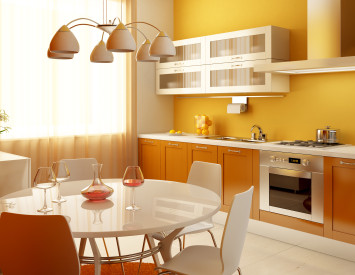
Sunny orange kitchen
Orange - the color of the sun, joy and ripe oranges. Like red, this shade improves appetite, besides, he gives a positive energy charge and improves the mood. Orange is often used in the interiors of cafes and fast food restaurants. This tint also excites the nervous system, but it is not so aggressive as red. Orange - the choice of joyful, vitality, optimistic thinking people.
In such a color scheme, you can perform almost any kitchen, regardless of its dimensions and illumination. Fortunately, the shades of orange there are quite a lot and for each specific case you can choose the most suitable option.
Solving which color headset is better to choose for orange kitchen, pay attention to white, black, gray and green shades.


Kitchen in yellow
The yellow interior is a good solution for those kitchens in which there is not enough sunlight. Yellow shades are able to illuminate the room even in the most gray and cloudy day. It is possible to achieve this sunny color with black and white parts. In this interior, the wenge color furniture will look good.
People with positive thinking, loving brightness and variety of paints, can be supplemented with red yellow and orange items. It looks very stylish and unusually a combination of yellow and gray shades. This option is suitable for strict agents that prefer ordering and organization.
Yellow-black looks bright and effectively, but it is better not to abuse with dark color, but only some details allocate. For example, black can be placed black, apron over a sink, floor, small details of furniture.
The kitchen in yellow-blue tones looks fresh and sees the memories of the summer. Furniture in a similar interior should cross the main shades. It can be blue, blue, sandy, can combine several similar colors.
Since yellow is associated with a sunny day, elements of wildlife should be present in the interior, for example, green plants. Of the additional parts you can also use wicker baskets, paths, mats, etc.


Brown kitchen interior
Brown, first of all, is associated with wood. Tree, in turn, symbol of nature, heat and coziness. It is not surprising that many people prefer to accompany the kitchens in a similar range, since the person is always striving to be closer to nature. The wooden kitchen looks natural, eco, environmentally friendly. In such a room, it is nice to gather with friends over a cup of hot tea or mulled wine ame, enjoying a homely pie or a sweet crispy cookie.
Brown can be used in almost any kitchen, while spoiling the interior will be almost impossible. Such a shade will suit people of any age, he can be used in many interior styles. In addition, brown surfaces are not so vintage, as, for example, white or yellow, which means to care for them is much easier.
Brown has a mass of shades: chestnut, chocolate, caramel, coffee, nut, sand and many others. These shades can be combined in a wide variety of variations and use them in combination with other, brighter colors, for example, with yellow, orange, green. Dark brown Gamma makes great harmony with beige and dairy tones, so deciding which color kitchen to choose under beige wallpaper, boldly use chocolates, coffee, chestnut shades. But black, purple, gray and dark blue tones in this room are not recommended.
Brown color often decorates the kitchens in retro style. In such interiors, it is customary to use the combinations of brown with pastel pink and blue shades. Natural style assumes the presence of two main tones: wood and green. Natural natural colors act in peaceful, relax well, promote rest.


Kitchen in green
Green, first of all, is associated with us with wildlife, health, well-being, longevity and youth. In the kitchen with such an interior will always be cozy and calmly. This shade is recommended for people who are often experiencing stress and nervous tension. Green seems to fill us from the inside of their harmony, gives peace and spiritual equilibrium.
From the rich color palette of green, you can choose the shade that best suits your temperament and taste preferences. This unique color can be both cold and warm, so you can use it in any room, regardless of its area and the degree of illumination. Warm greens well in tune with the gold, yellow, orange, beige, brown and light blue. Cool greens better to combine with blue, turquoise, mint color.
When you use the green range in the interior of the kitchen, you need to follow some rules. For example, if you plan to paint the green walls of the room, make sure that the furniture and accessories look more muted and restrained. If it is green kitchen walls is desirable to perform in lighter tones, for example, paint them in a beige or milk.


Kitchen in blue
The blue color in the interior of the kitchen is not hesitant to use too often, and not in all cases, it will look appropriate. For example, in a poorly lit room, whose windows are located on the northern side of this rigorous cold tone it is better not to use. In this case, Blue will act oppressively, causing depression, sadness, plunging into a melancholic state. But in a well-lit kitchen, bright blue interior may come in handy.
What you need to know about the blue colors in the interior of the kitchen:
- This shade reduces appetite. This property it is useful to those who are struggling with being overweight. But if a family has small children who are reluctant to eat mom cooked porridge, blue is better not to use.
- This affects not only the color on appetite, it is able to reduce pressure, slow heartbeat and even lowering body temperature. This means that active and active people blue is unlikely to fit.
- Such shade is not recommended to use too large kitchens. He will make the space empty, cold and uncomfortable.
- The interior in blue colors should not be monochrome. This color should be combined with other shades to the room did not seem lifeless.
- Colors that are most successful are in harmony with the blue, are as follows: light blue, sand, black, gray, bright yellow, orange. You can also use the individual parts olive, marsh, green, turquoise shades.
- Blue looks the most impressive, if present in the interior of several shades.


Purple kitchen interior
Purple color symbolizes wealth, power and mysticism. Kitchens with a similar interior are truly rare, and those who decide to use a similar shade in the decoration of the room, it is not necessary to get involved. The surplus of purple can cause depression, reduce activity, contribute to constant fatigue.
What color is the facade to choose for purple cuisine? With such a tinge, gold, olive or yellow tones are best combined. Saturated purple is better not to use as a dominant color, replacing it with a softer lilac or purple. Purple will look harmonious in detail and accessories.


Kitchen in black
With competent use, a gloomy black color can become a real find for the designer and turn the kitchen into the work of art. Especially good looks like a kitchen headset black on the background of light walls. This shade is as impossible to harmonize with white and red, and the combination of three-named colors allows you to create a truly luxurious and stylish interior.
Against the background of black any bright color details will look appropriate. However, the kitchen in such a color requires careful and continuous care, because on dark surfaces, especially glossy, pollution is noticeable no worse than on white.
Such a shade will be inappropriate in close rooms, as well as in the kitchens overlooking the windows on the north side. Consider some subtleties of using black in the kitchen interior:
- Black color is applicable not in all interior styles, but in the style of High-tech it looks more than by the way. Such an interior provides for the presence of glossy surfaces and an abundance of glass and metal.
- Black found himself and in a neo-style style, where it is successfully combined with a crystal and coarse brick masonry.
- In the premises made in the style of Neurokko, black is used in combination with silver.
- The black color should not be combined with brown tones, but next to yellow, red, green, white and orange it will look excellently. Especially spectacular and dramatically looks in the interiors where black is adjacent to gold or silver.
- Beautifully shade black kitchen mirror, glass and crystal parts. To emphasize the identity of the interior will help an interesting backlight.


White kitchen
Kitchens in white gamme are characteristic of high-tech styles, modern and classic. This shade is impracticious and requires careful care, besides, it is necessary to use it competently, so that the kitchen did not look like a sterile laboratory. White color in the kitchen interior is as if created in order to shade bright details. By the way, with such a tint, you can combine practical any tones: bright and dark, warm and cold. And it is such color accents that will set the main mood to the room.
In the white interior, various contrasts successfully look, which allows the use of original furniture. What color table top or lockers can be chosen for white kitchen? Yes, almost any. Black furniture is considered to be a classic option, it looks no less beautifully red headsets. Any bright colors, such as blue, yellow, orange, green, blue, will also be appropriate. This issue should be relying on the style of the room. For example, for high-tech, glass and metal are characteristic, in the classic interior there will be more relevant wooden furniture.
The kitchen, made in the white gamze, makes it possible to play with surface textures. Here you can combine smooth, embossed, glossy and matte materials.


Kitchen in turquoise gamma
Turquoise tint refers to the use of which should be observed. This color is more likely to look in detail and individual elements. For example, in the kitchen facades, in the decoration of one of the walls, in the curtains or other accessories. If you purchased a set of such a shade and wonder what color the walls to choose under turquoise kitchen, pay attention to warm wood tones. They will scream the coldness of turquoise and fill the room with comfort.
Turquoise color is often combined with white, beige, brown, milk, sandy, yellow, mustard, olive, pistachio shades. The combination of turquoise with purple color is a brave solution, but sometimes it allows you to achieve an unsurpassed, original and extravagant effect.